New User Interface for the Water Quality Portal
A new user interface was created for the Water Quatlity Portal. The redesign is more modern, intuitive, and mobile-friendly.
Over the past several months, our team worked to redesign the User Interface for the Water Quality Portal (WQP) to create a more modern, intuitive, and accessible website using principles of user-centered design. Our team has started using the United States Web Design System , which allowed us to build our new website in an accessible, mobile-friendly way.
Why did we make this change?
The former user interface for the WQP was created in 2012; since that time, we’ve learned a lot about how people interact with the webpage. To create a more user-oriented webpage, we 1) removed the legacy landing page, 2) created basic and advanced query interfaces, 3) made webservice links more visible and updated the documentation on how to use them, and 4) posted most recent data refresh dates, and 5) better visualized the upstream/downstream mapper.
Removed the Landing Page
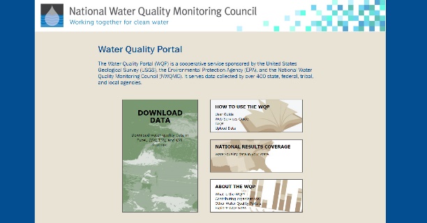
Users were confused by the landing page and they didn’t quite know where to click to access data. This was confirmed with the high bounce rate from the landing page; many people were leaving the page within seconds of viewing it. We removed the wordy homepage, and instead send users directly to the query form.

Landing page of the old Water Quality Portal User Interface

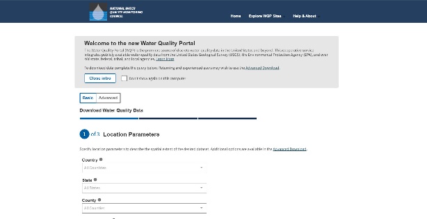
Landing page of the new Water Quality Portal User Interface
Created Basic and Advanced Search Options
We wanted to make the WQP easier to use, and less confusing for occasional users or members of the public trying to access data. Many users just wanted to do a simple search, with only a few inputs for their query. Therefore, we implemented a ‘Basic’ and ‘Advanced’ search option, allowing users to control the amount of query fields they see. Similarly, during user testing, we watched people struggle to understand query fields. We modified our tool tips on query fields to use plainer, simpler language so that users had a better understanding of their meaning.

A view of the Basic search stepper, showing users how to navigate the ‘Basic’ search with options to switch to the ‘Advanced’ search
Added Web Services Queries and Documentation
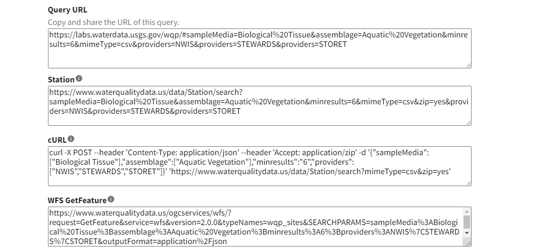
Over recent years, more users have discovered and started using the WQP’s web services and therefore wanted better guidance on constructing queries. We added web service queries to the bottom of the Advanced search form and re-wrote the Web Services Guide with added detail.

View of web service calls, which are now populated on teh Advanced search form
Recent Data Refresh Dates Added
Users asked that we include information about when data in the WQP were most recently updated, and we added that information to the footer. While redesigning the footer of the webpage, we also increased the visibility of our help desk contact information, so that users can get their questions answered more quickly.
Improving Location of Upstream/Downstream Mapper
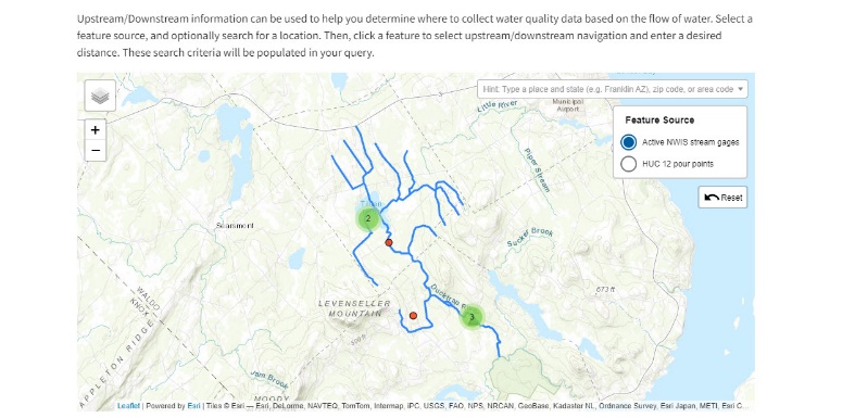
People commented that they enjoyed using the Upstream/Downstream mapper, but that it was in a confusing location in the query form. We’ve moved this to a collapsible part of the Advanced search form and clarified the wording about how this tool can be incorporated into a query.

Upstream/Downstream mapper, which is now a collapsible section of the Advanced search form
Still want to access the old User Interface?
We understand that our old User Interface was commonly used and well-loved. We’ll continue to keep the former User Interface accessible to users for a few months, with plans to turn it off sometime in late Spring of 2022. If you’d like to still use the old User Interface, you can access it at: labs.waterdata.usgs.gov/wqp .
We’re listening to you
We hope that this new interface is simpler, more intuitive, and easier for you to use. We’d love to hear your ideas for continuing to make this site better. Please email us at gs-w-iow_po@usgs.gov with your thoughts.

