
Origin and development of a Snowflake Map
Reproducible code demonstrating the evolution of a recent data viz of CONUS snow cover
What's on this page
The result
It’s been a snowy winter, so let’s make a snow cover map! This blog outlines the process of how I made a snowflake hex map of the contiguous U.S. The final product shows whiter snowflakes where snow cover was higher, which was generally in the northern states and along the main mountain ranges. I used a few interesting tricks and packages (e.g., ggimage , magick ) to make this map and overlay the snowflake shape. Follow the steps below to see how I made it.
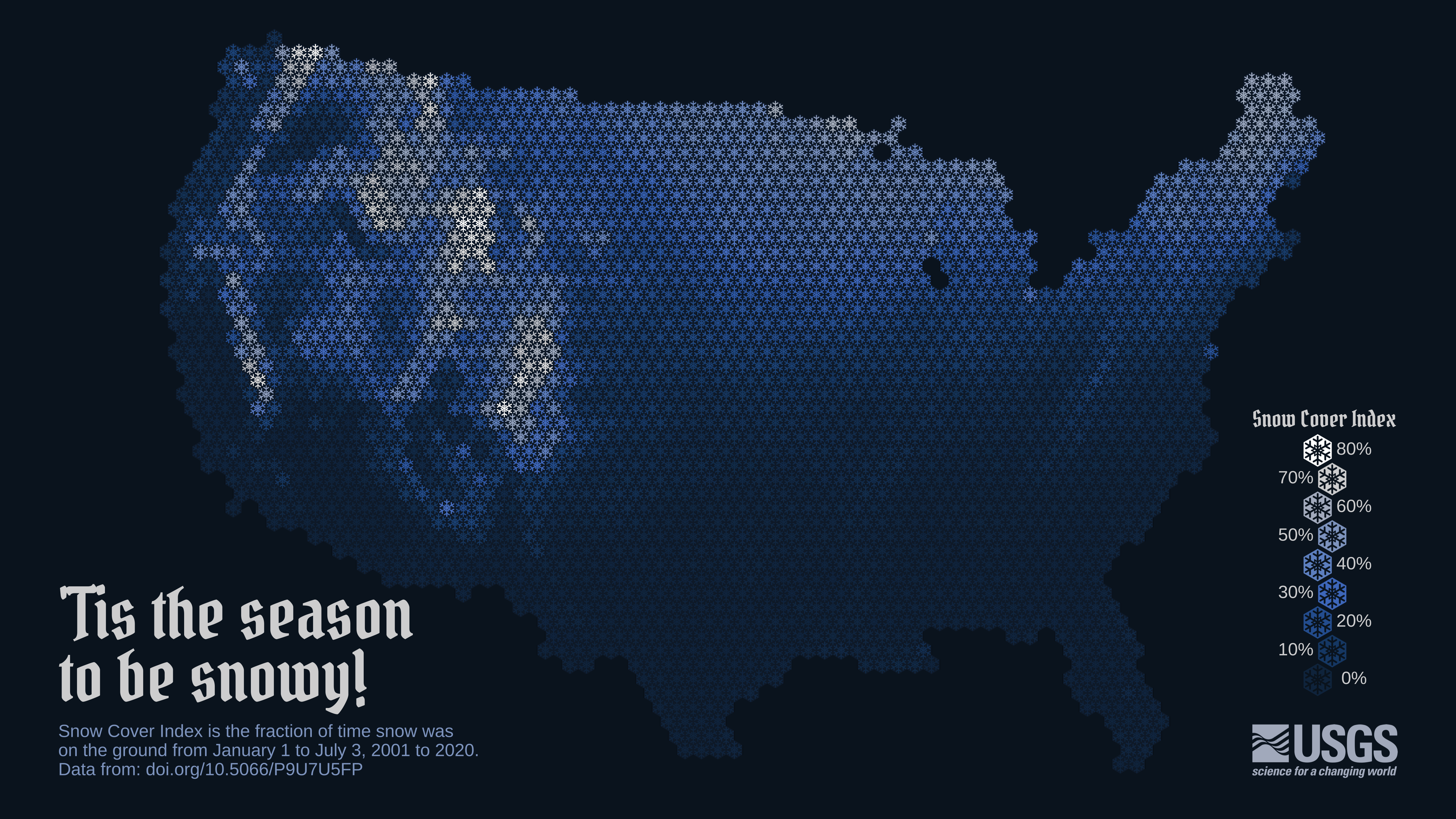
Final map released on Twitter.
The concept
This is a creation from the latest data visualization “Idea Blitz” with the USGS VizLab , where we experiment with new ideas, techniques or data.
My goal for the Idea Blitz was to create a map that showed average snow cover for the United States in a new and interesting way. My thought was that it would be cool to show a map of snow cover using snowflake shapes. Hexbin maps are fairly popular right now (example ), and I imagined a spin on the classic choropleth hexmap that showed mean snow coverage with a hexagonal snowflake-shaped mask over each state.
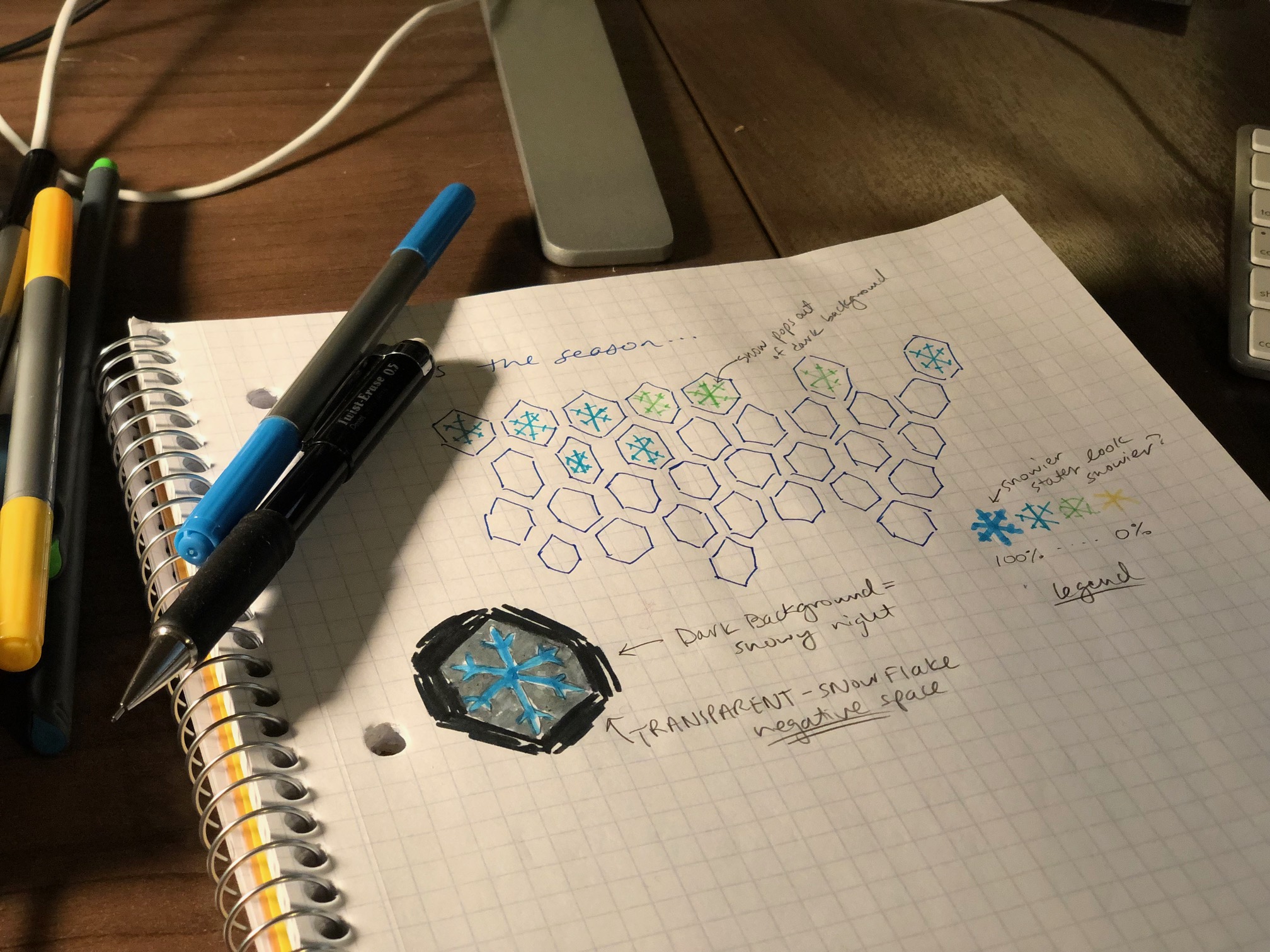
Concept sketch of the map.
The data
On ScienceBase I found a publicly-available dataset that had exactly what I was looking for: “Contiguous U.S. annual snow persistence and trends from 2001-2020.” (Thanks John Hammond !). These rasters provide Snow Cover Index (SCI) from 2001 through 2020 for the contiguous United States using MODIS/Terra Snow Cover 8-day L3 Global 500m Grid data. The SCI values are the fraction of time that snow is present on the ground from January 1 through July 3 for each year in the time series.
One note: At this point, I am limited by this dataset and the fact that it doesn’t include Alaska or Hawaii in its extent. My goal is to use the MODIS data directly in a future rendition so that I can include the complete U.S.
The data and code are open and reproducible so that you can try it out for yourself! Tweet @USGS_DataSci with your spin-off ideas, we’d love to see what you come up with!
Step 1. Download the snow cover index data
To begin, download the geotif raster files for SCI from 2001 through 2020 using the sbtools
package. After reading in the data files as a raster stack, calculate the mean across the 20 years for each raster cell, and plot it to see what the data look like.
library(sbtools) # used to download Sciencebase data
library(tidyverse) # used throughout
library(terra)

# Set up your global input folder name
input_folder_name <- "static/2023_snowtiles_demo"

# Download the snow cover index (SCI) raster
for(yy in 2001:2020){
  # if files already exist, skip download
  file_in <- sprintf("%s/MOD10A2_SCI_%s.tif", input_folder_name, yy)
  if(!file.exists(file_in)){ # if files don't exist, download
    sbtools::item_file_download(sb_id = "5f63790982ce38aaa23a3930",
                              names = sprintf("MOD10A2_SCI_%s.tif", yy),
                              destinations = file_in,
                              overwrite_file = F)
  }
}


# Read in SCI geotif files and convert to raster stack
sci_files <- list.files(sprintf("%s/", input_folder_name),
                        pattern = "MOD10A2_SCI",
                        full.names = T)
sci_stack <- terra::rast(sci_files)

# Calculate 20 year mean snow cover index (SCI) for each raster cell
sci_20yr_mean <- mean(sci_stack)

# Plot the 20 year mean snow cover index data as-is
terra::plot(sci_20yr_mean)
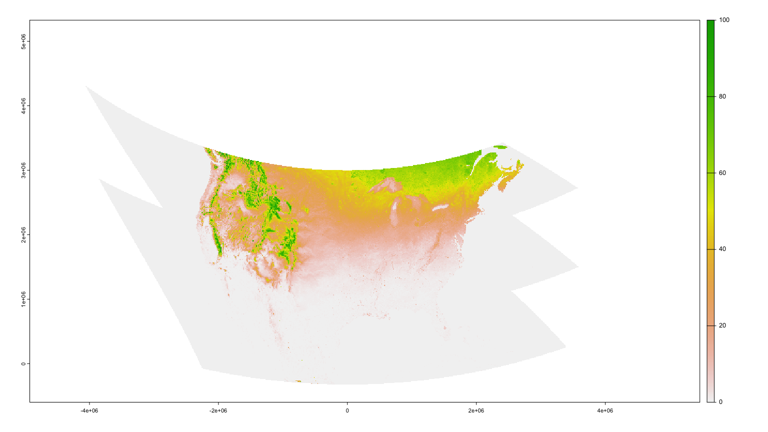
Map of 20-year-mean Snow Cover Index as downloaded from Science Base.
Step 2: Summarize the SCI values by state
My original concept was to make a state-level hexbin map. I started by spatially averaging the snow cover data to each state’s boundary. To do this, import CONUS state boundaries and re-project them to match the raster’s projection. Then, extract 20-year mean SCI values from the raster to the state polygon boundaries and summarize by state. Then let’s plot the results as a choropleth to see what it looks like. I’m using a dark plot background to make the snowier whites show up with high contrast against the deep blue background.
library(spData)
library(sf)
library(scico)

# Download US State boundaries as sf object
states_shp <- spData::us_states

# Reproject the sf object to match the projection of the raster
states_proj <- states_shp |> sf::st_transform(crs(sci_20yr_mean))

# Clip the raster to the states boundaries to speed up processing
sci_stack_clip <- terra::crop(x = sci_20yr_mean, y = vect(states_proj), mask = TRUE)

# Extract the SCI values to each state
extract_SCI_states <- terra::extract(x = sci_stack_clip, vect(states_proj))

# Calculate mean SCI by state
SCI_by_state <- as.data.frame(extract_SCI_states) |>
  group_by(ID) |>
  summarise(mean_20yr = mean(mean, na.rm = T))

# Left-join calculated 20-year SCI means to the US States sf object
SCI_state_level <- states_proj |>
  mutate(ID = row_number()) |>
  left_join(SCI_by_state, by = "ID")

# Set up theme for all maps to use, rather than default
theme_set(theme_void()+
            theme(plot.background = element_rect(fill = "#0A1927"),
                  legend.text = element_text(color = "#ffffff"),
                  legend.title = element_text(color = "#ffffff")))
  # #0A1927 comes from
  # scico::scico(n = 1, palette = "oslo", direction = 1, begin = 0.1, end = 0.1)

# Plot choropleth
ggplot() +
  geom_sf(data = SCI_state_level, aes( fill = mean_20yr)) +
  scico::scale_fill_scico(palette = "oslo", direction = 1, begin = 0.25)
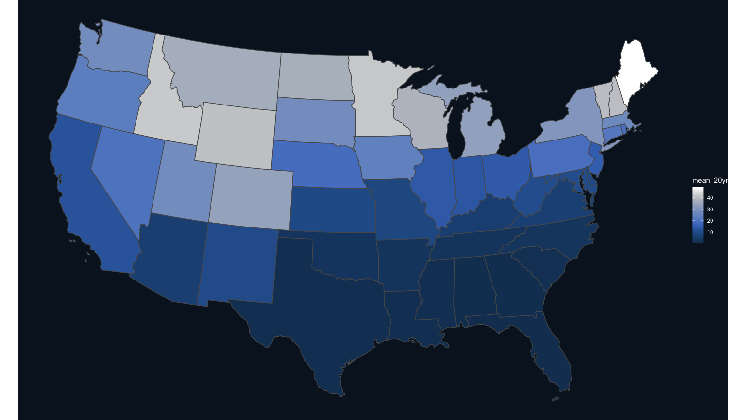
Map of 20-year-mean Snow Cover Index spatially summarized by state.
Step 3: Make a state-level hexmap choropleth
To remind you, my goal was to use a snowflake shape over the choropleth, so I wanted the states to be hexagonal in shape to mirror the shape of a snowflake. To convert the states into hexagons, download a pre-made dataset of the hexagons in a geojson file format. Import this as an sf object, ready for plotting, and join with the mean SCI data to create the choropleth.
library(geojsonsf)
library(broom)
library(rgeos)

# Download the Hexagons boundaries in geojson format here: https://team.carto.com/u/andrew/tables/andrew.us_states_hexgrid/public/map.

# Load this file.
spdf_hex <- geojsonsf::geojson_sf(sprintf("%s/us_states_hexgrid.geojson",
                                          input_folder_name)) |>
  # drop the verbose ids
  mutate(NAME = gsub(" \\(United States\\)", "", google_name)) |>
  # filter out Alaska and Hawaii
  filter(! NAME %in% c("Alaska", "Hawaii"))

# Left bind the mean SCI data
spdf_hex_sci <- spdf_hex |>
  left_join(as.data.frame(SCI_state_level) |> select(NAME, mean_20yr), by = "NAME")

# Now plot this state-level map as easily as described before:
ggplot() +
  geom_sf(data = spdf_hex_sci, aes( fill = mean_20yr)) +
  scale_fill_scico(palette = "oslo", direction = 1, begin = 0.25)
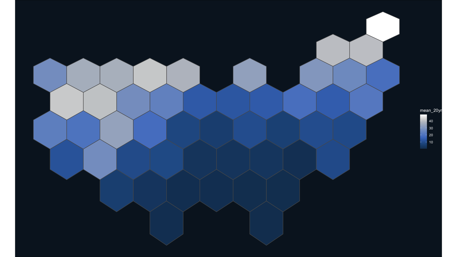
Map of 20-year-mean Snow Cover Index spatially summarized by state, with each state shaped like a hexagon.
Step 4: Make a snowflake state-level hexmap choropleth
Finally, the first draft of my hexagon choropleth is ready for refinement, including the addition of the snowflake mask that I created in Illustrator. This png has a transparent background and will allow the color of the state to show through.

Vectorized snowflake mask, ready for all your mapping uses!
To make this rendition, use the packages ggimage and cowplot to overlay the png and create a 16x9 composition, respectively. There are two tricks to using the ggimage overlay approach here. First, note that it’s necessary to use the st_coordinates() function to extract the coordinates in a form that ggimage can read. Secondly, the aspect ratio and size arguments of the geom_image function (asp and size, respectively) need to be toggled until they fit the map’s hexagon shape and size. Finally, I used a free typeface from Google fonts that felt like it had that winter holiday style I was going for.
library(cowplot)
library(showtext)
library(sysfonts)
library(ggimage)

# First make the main choropleth with snowflakes laid on top
hexmap <- ggplot() +
  # main hexmap
  geom_sf(data = spdf_hex_sci,
          aes(fill = mean_20yr),
          color="#25497C") +
  # snowflake overlay with centroids in "x" and "y" format for ggimage to read
  ggimage::geom_image(aes(image = sprintf("%s/snowMask.png", input_folder_name),
                          x = st_coordinates(st_centroid(spdf_hex_sci))[,1],
                          y = st_coordinates(st_centroid(spdf_hex_sci))[,2]),
                      asp = 1.60, size = 0.094) +
  scale_fill_scico(palette = "oslo", direction = 1, begin = 0.20, end = 1) +
  theme(legend.position = "none")

# Load some custom fonts and set some custom settings
font_legend <- 'Pirata One'
sysfonts::font_add_google('Pirata One')
showtext::showtext_opts(dpi = 300, regular.wt = 200, bold.wt = 700)
showtext::showtext_auto(enable = TRUE)

# For now, just using simple white for the font color
text_color <- "#ffffff"

# background filled with dark blue, extracted from scico but darker than used in the map's color ramp
canvas <- grid::rectGrob(
  x = 0, y = 0,
  width = 16, height = 9,
  gp = grid::gpar(fill = "#0A1927", alpha = 1, col = "#0A1927")
  # #0A1927 comes from
  # scico::scico(n = 1, palette = "oslo", direction = 1, begin = 0.1, end = 0.1)
)

# Make the composition using cowplot
ggdraw(ylim = c(0,1),
       xlim = c(0,1)) +
  # a background
  draw_grob(canvas,
            x = 0, y = 1,
            height = 9, width = 16,
            hjust = 0, vjust = 1) +
  # the national hex map
  draw_plot(hexmap,
            x = 0.01,
            y = 0.01,
            height = 0.95) +
  # map title
  draw_label("\'Tis the season to be snowy!",
             x = 0.05,
             y = 0.9,
             hjust = 0,
             vjust = 1,
             fontfamily = font_legend,
             color = text_color,
             size = 26)
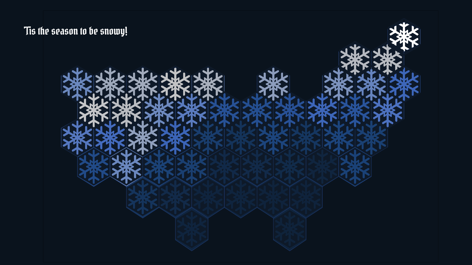
Map of 20-year-mean Snow Cover Index spatially summarized by state, with each state shaped like a hexagon. This was the first draft shared back to the Vizlab team.
It was really cool to see my first idea come to life in this map!
Step 5: Refine the snowflake map with a finer resolution hexmap
The image above was shared out with my working group, and although we all thought it was neat, it also doesn’t really show enough variety of snow pack in the contiguous U.S. – each state has areas of higher and lower snowfall that are not represented at this coarse scale. To address this, we decided on a more customized hexagon grid that had finer resolution than state-level.
Using a built-in feature of the package sf, st_make_grid(), create a hexagonal spatial grid over the contiguous United States, using the state boundaries as the extent. Map that over the boundaries to get an idea for how small these new hexagons are in relation to the state boundaries.
# make hex tesselation of CONUS
columns <- 70
rows <- 70
hex_grid <- states_proj %>%
  # using the project states boundaries, make a hexagon grid that is 70 by 70 across the US
  sf::st_make_grid(n = c(columns, rows),
               what = "polygons",
               # if square = TRUE, then square. Otherwise hexagonal
               square = FALSE) %>%
  sf::st_as_sf() %>%
  mutate(geometry = x) %>%
  mutate(hex = as.character(seq.int(nrow(.))))

# Map with states on top to see if the hexagons all lined up correctly
ggplot(hex_grid) +
  geom_sf(fill = "NA", color = "#999999") +
  geom_sf(data = states_proj |> st_as_sf(), color = "cyan", fill = "NA")
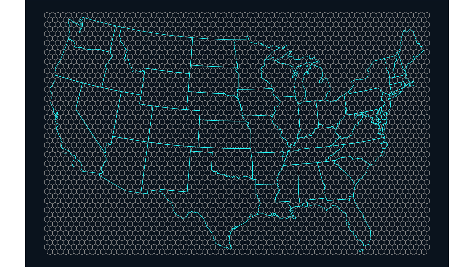
Map that shows the size and shape of the hexagonal grid in relation to the state boundaries.
Next, follow the same steps as above to extract the 20-year mean SCI values to each hexagon and recreate the map, this time with a much finer resolution snowflake.
# Extract values to the hexagon grid from the masked raster
extract_SCI_hex <- terra::extract(x = sci_stack_clip, vect(hex_grid))

# Calculate the 20-year SCI means to each hexagon
SCI_by_hex <- as.data.frame(extract_SCI_hex) |>
              group_by(ID) |>
              summarise(mean_20yr = mean(mean, na.rm = T))

# Calculate 20-year SCI means and left-join to the hexagon grid sf object
SCI_hex_grid <- hex_grid |>
  mutate(ID = row_number()) |>
  left_join(SCI_by_hex, by = "ID") |>
  filter(! is.na(mean_20yr)) # delete hexagons outside the US boundaries

# Map the mean SCI values to see if the joins and calculations worked
SCI_hex_grid %>%
  ungroup() %>%
  ggplot() +
  geom_sf(aes(fill = mean_20yr),
          color = "black",
          size = 0.2) +
  scale_fill_scico(palette = "oslo", direction = 1, begin = 0.20, end = 1)
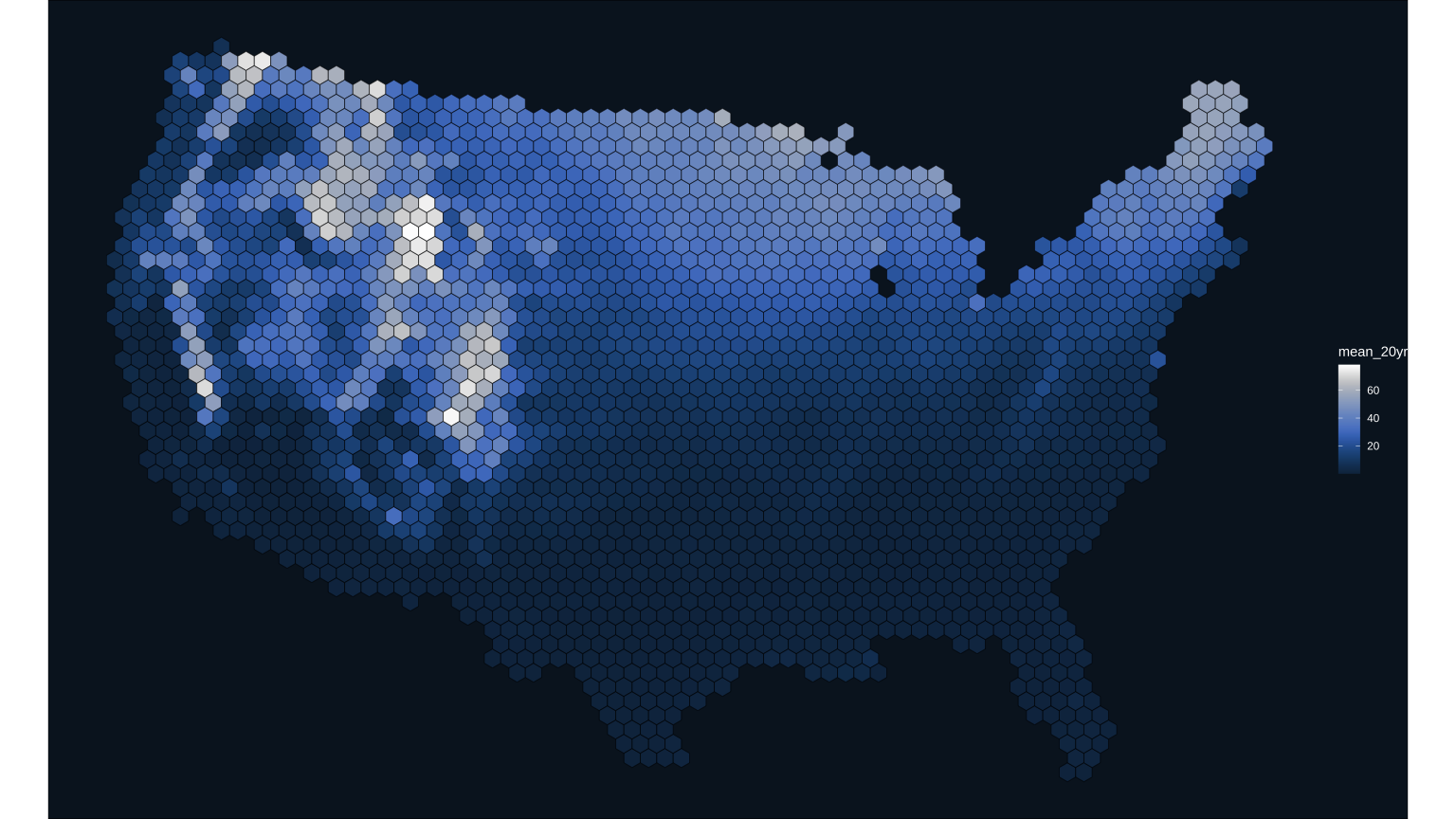
This map version shows a lot more detail in where snow is across the contiguous United States. Just need to add on the snowflake mask!
Next, add in the snowflake mask as a png. Again, it’s necessary to use the st_coordinates(st_centroid()) functions to extract the centroid coordinates in a form that the ggimage package can read, and the aspect ratio and size of the image will have to be tweaked again to match the new, smaller hexagons.
SCI_hex_grid |>
  ungroup() %>%
  ggplot() +
  geom_sf(aes(fill = mean_20yr),
          color = "black",
          size = 0.2) +
  scale_fill_scico(palette = "oslo", direction = 1, begin = 0.20, end = 1) +
  ggimage::geom_image(aes(image = sprintf("%s/snowMask.png", input_folder_name),
                          x = st_coordinates(st_centroid(SCI_hex_grid))[,1],
                          y = st_coordinates(st_centroid(SCI_hex_grid))[,2]),
                      asp = 1.60, size = 0.015) +
  theme_void()+
            theme(plot.background = element_rect(fill = "#0A1927"),
                  legend.text = element_text(color = "#ffffff"),
                  legend.title = element_text(color = "#ffffff"))
This snowflake map turned out better than I had hoped. Next step is to clean up the map composition and add in text and legends.
Step 6: Finalize the map and customize the layout
The last thing to do is make a custom legend, add in the USGS logo, and clean everything up for sharing out. A cool trick I’m going to use for the custom legend is to take the snowflake mask and use the package magick to colorize it so that it matches the colors used in the scico palette. Functions are used here to systematically produce a custom legend with staggered snowflakes and text labels.
I made the final image for Twitter in a 16x9 format with the ggsave function.
Twitter layout
library(magick)
library(purrr)

# Use the built in scico function to extract 9 values of colors used in the scico color scale
colors <- scico::scico(n = 9, palette = "oslo", direction = 1, begin = 0.20, end = 1)

# Direct magick to the image file of the snowflake mask
snowflake <- magick::image_read(sprintf("%s/snowMask.png", input_folder_name))

# Assign text colors to the nearly-white value of the color ramp
text_color = colors[8]

# Load in USGS logo and colorize it using the color ramp
usgs_logo <- magick::image_read(sprintf("%s/usgs_logo.png", input_folder_name)) %>%
  magick::image_colorize(100, colors[7])

# Define some baseline values that we will use to systematically build custom legend
legend_X = 0.405 # baseline value for the legend hexagons - every other one will stagger off this
legend_X_evenNudge = 0.01 # amount to shift the evenly numbered legend pngs
legend_Y = 0.15 # baseline for bottom hex, each builds up off this distance
legend_Y_nudge = 0.035 # amount to bump the png up for each legend level

# First function here creates a staggered placement for each of the 9 snowflakes in the legend
hex_list <- purrr::map(1:9, function (x){
  # determine if odd or even number for X-positioning
  nudge_x <- function(x){
    if((x %% 2) == 0){ #if even
      return(legend_X_evenNudge)
    } else {
      return(0)
    }
  }

  # Draw image based on baseline and nudge positioning
  draw_image(snowflake |>
               magick::image_colorize(opacity = 100, color = colors[x]),
             height = 0.04,
             y = legend_Y + legend_Y_nudge*(x-1),
             x = legend_X + nudge_x(x))
})

# Second function here similarly systematically places the labels aside each legend snowflake
legend_text_list <- purrr::map(1:9, function (x){
  # determine if odd or even number for X-positioning
  nudge_x <- function(x){
    if((x %% 2) == 0){ #if even
      return(0.04)
    } else {
      return(0)
    }
  }

  # Draw text based on baseline and nudge positioning
  draw_text(sprintf("%s%%", (x-1)*10),
            y = legend_Y + legend_Y_nudge*(x-1),
            x = 0.93 - nudge_x(x),
            color = text_color,
            vjust = -1)
})

# Define the main plot
main_plot <- SCI_hex_grid |>
  ungroup() %>%
  ggplot() +
  geom_sf(aes(fill = mean_20yr),
          color = "black",
          size = 0.2) +
  scale_fill_scico(palette = "oslo", direction = 1, begin = 0.20, end = 1) +
  ggimage::geom_image(aes(image = sprintf("%s/snowMask.png", input_folder_name),
                          x = st_coordinates(st_centroid(SCI_hex_grid))[,1],
                          y = st_coordinates(st_centroid(SCI_hex_grid))[,2]),
                      asp = 1.60, size = 0.015) + #ggimage package
  theme(legend.position = "none")

ggdraw(ylim = c(0,1),
       xlim = c(0,1)) +
  # a background
  draw_grob(canvas,
            x = 0, y = 1,
            height = 9, width = 16,
            hjust = 0, vjust = 1) +
  # national hex map
  draw_plot(main_plot,
            x = 0.01, y = 0.01,
            height = 1) +
  # explainer text
  draw_label("Snow Cover Index is the fraction of time snow was\non the ground from January 1 to July 3, 2001 to 2020.\nData from: doi.org/10.5066/P9U7U5FP",
             fontfamily = sysfonts::font_add_google("Source Sans Pro"),
             x = 0.04, y = 0.115,
             size = 14,
             hjust = 0, vjust = 1,
             color = colors[6])+
  # Title
  draw_label("\'Tis the season\nto be snowy!",
             x = 0.04, y = 0.285,
             hjust = 0, vjust = 1,
             lineheight = 0.75,
             fontfamily = font_legend,
             color = text_color,
             size = 55) +
  # Legend title
  draw_label("Snow Cover Index",
             fontfamily = font_legend,
             x = 0.86, y = 0.50,
             size = 18,
             hjust = 0, vjust = 1,
             color = text_color)+
  # Legend snowflakes
  hex_list +
  # Legend lables
  legend_text_list +
  # Add logo
  draw_image(usgs_logo,
             x = 0.86, y = 0.05,
             width = 0.1,
             hjust = 0, vjust = 0,
             halign = 0, valign = 0)
# Save the final image in Twitter's 16 by 9 format
ggsave(sprintf("%s/snowtilesTwitter.png", input_folder_name),
       width = 16, height = 9, dpi = 300)
Final map released on Twitter.
And with that, you have all the code and the snowflake mask to make these maps or your own version of a snow map!
Special thanks to Cee , Hayley , Elmera , Anthony , Nicole , and Mandie for their help with this viz.
Related Posts
Easy hydrology mapping with nhdplusTools, geoconnex, and ggplot2
November 28, 2025

Go from hard-to-read default visuals to easy-to-read river maps in a few easy steps!
Tutorial of dataRetrieval's newest features in R
November 26, 2025
This article will describe the R-package
dataRetrieval, which simplifies the process of finding and retrieving water from the U.S. Geological Survey (USGS) and other agencies. We have recently released a new version ofdataRetrievalto work with the modernized Water Data APIs . The new version ofdataRetrievalhas several benefits for new and existing users:Charting 'tidycensus' data with R
June 24, 2025
In January, 2025, the organizers of the tidytuesday challenge highlighted data that were featured in a previous blog post and data visualization website . Some of us in the USGS Vizlab wanted to participate by creating a series of data visualizations showing these data, specifically the metric “households lacking plumbing.” This blog highlights our data visualizations inspired by the tidytuesday challenge as well as the code we used to create them, based on our previous software release on GitHub .
The Hydro Network-Linked Data Index
November 2, 2020
Introduction
updated 11-2-2020 after updates described here .
updated 9-20-2024 when the NLDI moved from labs.waterdata.usgs.gov to api.water.usgs.gov/nldi/
The Hydro Network-Linked Data Index (NLDI) is a system that can index data to NHDPlus V2 catchments and offers a search service to discover indexed information. Data linked to the NLDI includes active NWIS stream gages , water quality portal sites , and outlets of HUC12 watersheds . The NLDI is a core product of the Internet of Water and is being developed as an open source project. .
Jazz up your ggplots!
July 21, 2023
At Vizlab , we make fun and accessible data visualizations to communicate USGS research and data. Upon taking a closer look at some of our visualizations, you may think: