
Release Notes for October 16, 2019
A summary of new features and tools released on October 16, 2019
What have we been up to?
This sprint, the team has been working primarily on features that are tied to the cloud version of the USGS Publications Warehouse . Unfortunately, these features are not publicly available yet, and as such, we aren’t able to share them. But, there will be an extensive post about the Publications Warehouse work when the application makes the jump to the cloud and features become available. In addition to that work, we have added a couple new features to the Water Data for the Nation monitoring location pages; that will be the subject of the rest of these release notes.
User Stories
For this sprint, and future sprints, the release notes will include the user stories that the Water Data for the Nation development team uses to describe units of work. User stories help us remember who we are doing the work for, what we need to do, and why it is important. They are a core part of agile software development, which is how we do our work.
A user story generally takes this form: “As a ___ who ____ I want ____ what ______ so that ____ why _____”
New features and tools
Monitoring Location pages
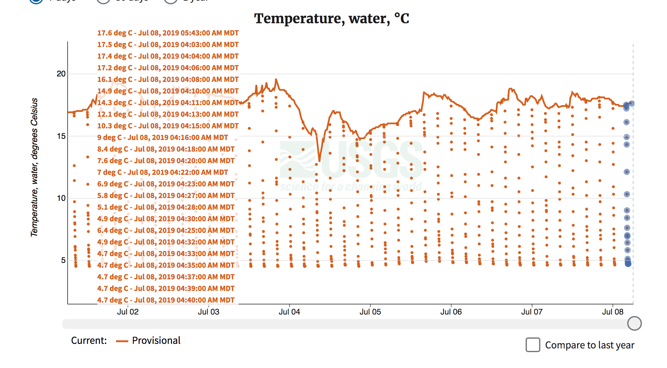
Celsius and Fahrenheit degrees on temperature scales.
User story: As an angler, I want to see temperature data displayed in Fahrenheit units in addition to Celsius, so that I don’t have to convert the temperature in my head from a less familiar scale to a scale I intuitively understand.
Of the hundreds of comments submitted by users on the new real-time data pages, one of the most requested features of the new pages was to convert temperature in degrees Celsius to degrees Fahrenheit. This sprint, we released a second y-axis scale that displays Fahrenheit units for temperature records, as well as a second value in the data label at the top of the figure that now displays both Fahrenheit and Celsius units.
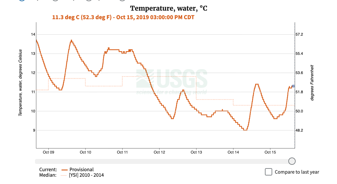
Temperature for seven days at USGS monitoring location number 05406457, Black Earth Creek nr Brewery Rd at Cross Plains, WI, showing the temperature in Fahrenheit and Celsius
Better axis scaling
User story: As a water manager looking at discharge data, I don’t want to see the whole dataset crammed into a small portion of the graph, so that I can better understand what is happening.
Discharge – or the volume of water moving down a stream per unit of time – is a core time series dataset that the USGS collects. You can learn more about discharge at the USGS Water Science School . Discharge is highly variable:it is not uncommon to see a site cover four orders of magnitude in less than a day. Discharge data can range from -500 cubic feet per second (cfs) in tidal rivers, up to 500,000 cfs on the Mississippi, making it is one of the hardest variables to effectively plot. In order to plot this large range of data effectively, and in an automated way, a logarithmic (a.k.a. log) scale is used. Despite using a log scale, some plots still did not display properly, leaving a lot of empty space on the graph. The issue that we solved in this sprint was to choose a better lower bound. Previously, we tied the lower bound to the next lowest order of magnitude. For example, a hydrograph for a site like Lees Ferry, AZ that hovers around 10,000 cfs of discharge was left with a lot of empty space.
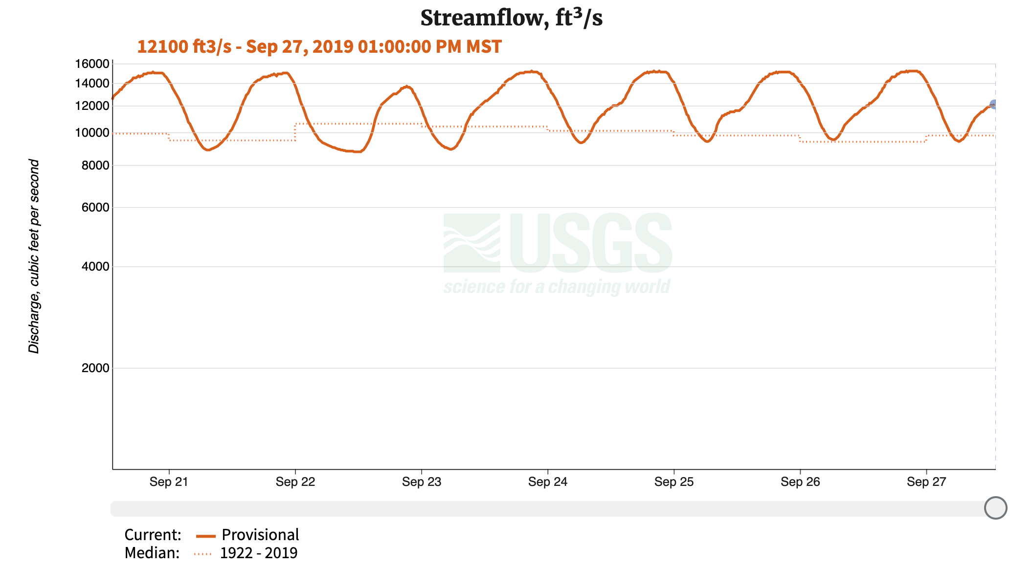
Discharge for seven days at USGS monitoring location number 09380000, Colorado River at Lees Ferry, AZ, using the older axis scaling approach
By changing the algorithm to select a lower bound less than an order of magnitude less than the average value, we were able to take advantage of all the space in the hydrograph, making it easier to make sense of the data.
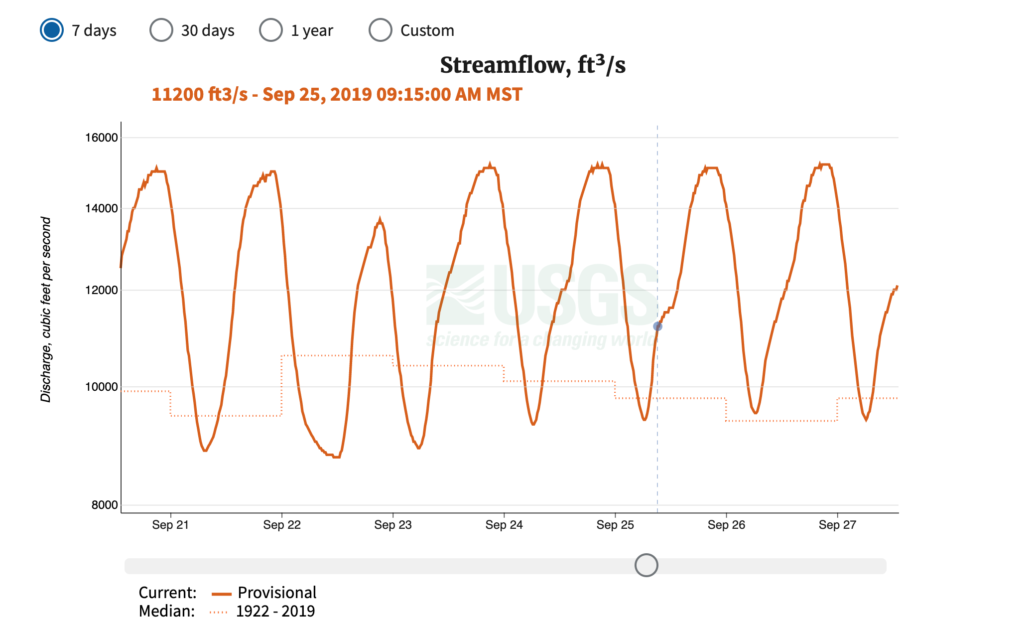
Discharge for seven days at USGS monitoring location number 09380000, Colorado River at Lees Ferry, AZ, using the newer axis scaling approach
Feature Flagged Stories
These stories aren’t quite ready to be released to production, but we are very excited about them. We commonly use what are called “feature flags ” on a feature that is not quite ready for public consumption, so that we can still release the rest of the project, while setting aside the overhead of complex code management workflows. Feature flagging also allows problematic or broken features to be quickly removed from the production system.
Monitoring location cameras
Many hundreds of USGS monitoring locations have cameras co-located with other instruments, which add another dimension of data to the data that the USGS collects. We are working on a first pass solution for putting images and time lapse videos from these cameras on the monitoring location pages. This is an area of significant expansion for the USGS, and we expect quite a bit of additional work on this as we build out the Next Generation Water Observing System (NGWOS).
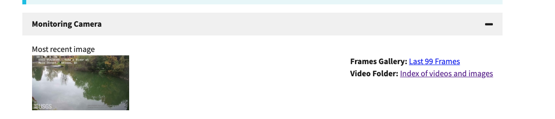
A screenshot from the development version of the new pages, showing a camera that is located at monitoring location number 05428500, Yahara River at East Main Street at Madison, WI
Working with multiple time series data on a single graph.
USGS time series data systems are built to handle a single instance of a given parameter code per site; for example, one temperature sensor per site. However, USGS often collects multiple time series for a single parameter code at a single monitoring location: for example, several temperature sensors may be placed at different depths at a single location. Currently, various time series are encoded into a string of text that gives more details about what the differences are across these measurements. This text is not displayed on the new monitoring location pages, instead we would display all the times series on the same graph. This can get messy, as can be seen at this site, which has a profiler buoy:
A screenshot showing temperature at monitoring location number 420407111201201, Bear Lake 3.6 miles northeast of Fish Haven, Idaho. There are 26 different temperature time series, each at different depths of a lake
A first attempt to let a user choose a single time series was still confusing. So, there are three more smaller stories in development this sprint that we hope will make multiple time series for a single parameter code more approachable. We’ll look for feedback from users about how this works soon.
On a side note, investigation into the display of multiple time series has revealed data management improvements that need to be made in both back end systems and front end services. We expect super gages with many sensors to become more common in the future, as the Next Generation Water Observing System (NGWOS) is built out. More on this to come.
What is coming up for next sprint
Here’s what else you can look forward to next time:
Better handling of median lines
Better time series data display for multiple time series on one parameter
Disclaimer
Any use of trade, firm, or product names is for descriptive purposes only and does not imply endorsement by the U.S. Government.
Categories:
Keywords:
Related Posts
Release Notes for November 13, 2019
November 13, 2019
What have we been up to? This sprint, we have been working on a number of features that are the groundwork for future tools. Most notably, we are developing a working monitoring location services system based on the new Open Geospatial Consortium OGC API-Features standard .
Release Notes for September 25, 2019
September 25, 2019
What have we been up to? This is the first of a series of posts in which newly released features in the Water Data for the Nation family of applications are described.
Release Notes for July 21st, 2020
July 21, 2020
What have we been up to? Pubs Warehouse moved to the Cloud Behind the scenes work New features and tools Pubs Warehouse on the Cloud The Water Data for the Nation team is the primary development team for another high profile application, the USGS Publications Warehouse .
Release Notes for late March 2020
April 10, 2020
What have we been up to? Image server work Period parameter Axis scaling Networks page New features and tools Image export from monitoring location pages One of the most requested features we receive from users is the ability to export images from the monitoring location pages.
Release Notes for late February and early March 2020
March 20, 2020
What have we been up to? Added handles to brush on the monitoring location page hydrograph State of hydrograph saved for bookmarking/linking Display upstream basin from NLDI for each monitoring location A number of additional graph server parameters New data services for monitoring locations Brush handles added to monitoring location page hydrograph Based on user feedback, the team upgraded the brush and zoom capability on the hydrograph by adding handles, making it more apparent that the zoom functionality is available and making it easier to use.