EGRET plotFlowConc using ggplot2
Using the R packages, ggplot and EGRET, a new function plotFlowConc shows a new way to visualize the changes between flow and concentration.
Laura DeCicco
Introduction
EGRET
is an R-package for the analysis of long-term changes in water quality and streamflow, and includes the water-quality method Weighted Regressions on Time, Discharge, and Season (WRTDS). It is available on CRAN.
More information can be found at https://github.com/DOI-USGS/EGRET .
ggplot2
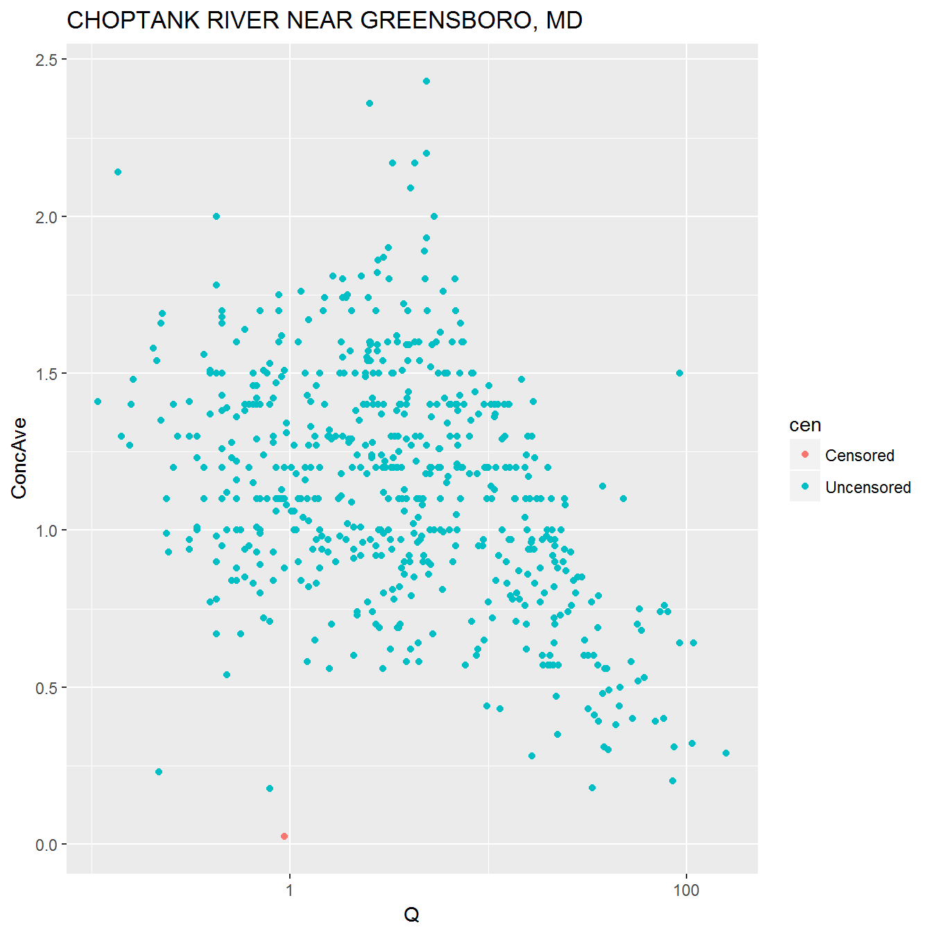
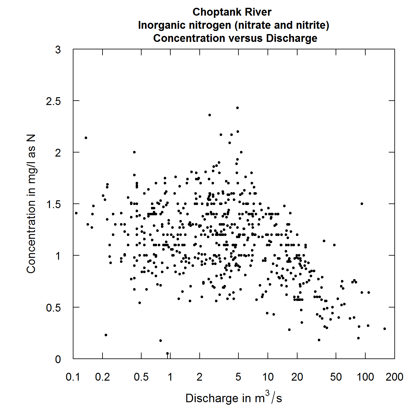
ggplot2 is a powerful and popular graphing package. AllEGRET functions return, or take as an input, a specialized list (referred as the “eList” in EGRET documentation). It is quite easy to extract the simple-to-use, relavent data frames: Daily, Sample, and INFO. Here is a simple example of using ggplot2 to make a plot that is also available in EGRET.
Please note there are a lot of nuances that are captured in the EGRET plotting functions that are not automatically captured by using ggplot2. However, this simple example can give you the minimal workflow you might need to create your own more specialized ggplot2 EGRET plots.
plotConcQ

ggplot2 Concentration Flow plot

EGRET Concentration Flow plot
plotFlowConc
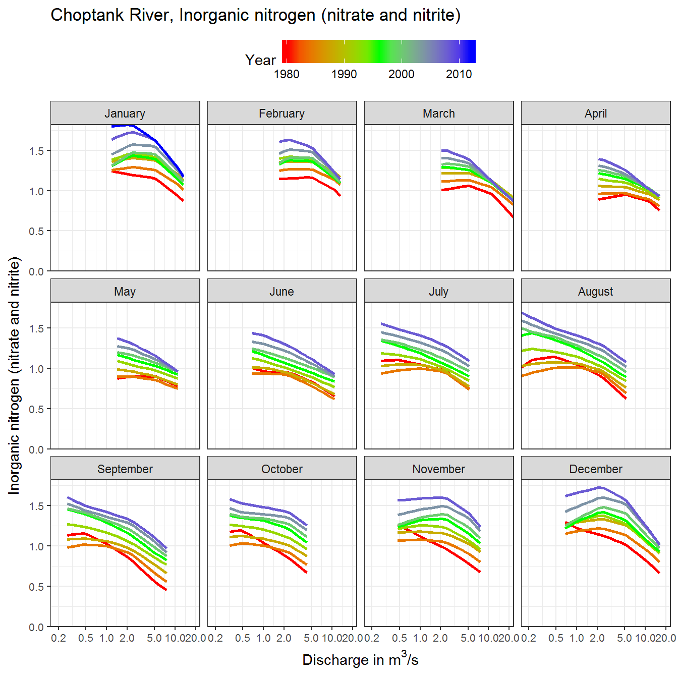
One of the things the WRTDS statistical model provides is a characterization of the gradually changing relationship between concentration and discharge as it evolves over a period of many years, and also a characterization of how that pattern is different for different times of the year.
The plotContours, plotDiffContours, plotConcQSmooth, and plotConcTimeSmooth functions in EGRET are all designed to help the user explore various aspects of the model. Because of the multivariate character of the model it is helpful to have a variety of ways to view it to aid in making interpretations about the nature of the changes that have taken place. Another approach is one developed by Marcus Beck of US EPA that makes very effective use of color and multiple panel graphs to help visualize these evolving conditions. This new function plotFlowConc which uses the packages ggplot2, dplyr, and tidyr is a wonderful new way to visualize these changes.
The function can also be imported in the workspace from GitHub:
Next, the function can be called with any EGRET object:

Custom plotFlowConc
This graphic allows the user to see a variety of types of changes. For example, if the curves substantially change their shape over time it may suggest shifts among various pollutant sources (e.g. shallow groundwater, deeper groundwater, point sources, and surface runoff). It may also show changes that are strong in some seasons and weak in others because of factors like shifts in the time when nutrients are applied to the landscape or changes in cropping practices (e.g. no-till farming or cover crops). It can also show seasons when change may be accelerating versus others where conditions may have become more stable over time. All of these kinds of patterns can be useful in developing interpretations of the kinds of changes taking place and can help the user to develop hypotheses that they can test out in a formal manner with the existing data or by adding new data over time.
The plotFlowConc function has several arguments that control the plot aesthetics. The only argument that is required is the first one (eList), all the others have defaults that result in a highly presentable graphic, but there are options that the user can chose if they wish to vary the look of their output.
eListinputEGRETobjectmonthnumeric input from 1 to 12 indicating the monthly predictions to plotyearsnumeric vector of years to plot. For example,seq(1980, 2014, by = 4)will plot nine years of data from 1980 to 2014 at four year intervals. Set asNULLto plot all yearscol_vecchr string of plot colors to use, passed toggplot2::scale_colour_gradientfor line shadingylabelchr string for y-axis labelxlabelchr string for x-axis labelalphanumeric value from zero to one for line transparencysizenumeric value for line sizeallflological indicating if the flow values are limited to the fifth and ninety-fifth percentile of observed values for each monthncolnumeric argument passed toggplot2::facet_wrapindicating number of facet columnsgridslogical indicating if grid lines are presentscaleschr string passed toggplot2::facet_wrapto change x/y axis scaling on facets, acceptable values are ‘free’, ‘free_x’, or ‘free_y’interpnumeric input as a scalar for smoothing the plot lines. The default is 4 indicating that four times as many values are interpolated and plotted compared to the original results matrix from WRTDS. The interpolation does not create novel data outside the range of the predictions but instead creates observations in the time, flow domain that are between values that were used explicitly to create the model. The effect is a smoother plot that reduces the jaggedness of the lines. A value of 1 orNULLcan be used to suppress this behavior if the WRTDS results matrix is sufficiently large, i.e., minimal jaggedness in the plot lines. Values larger than 4 typically do not improve the visual appearance of trends.prettylogical indicating if preset plot aesthetics are applied, otherwise the ggplot2 default themes are useduse_bwlogical indicating ifggplot2::theme_bwis usedfac_nmsoptional chr string for facet labels, which must be equal in length tomonthyminnumeric input for lower limit of y-axis, applies only ifscales = NULLorscales = free_x
Questions
Please direct any questions or comments on EGRET to: https://github.com/DOI-USGS/EGRET/issues
Questions about plotFlowConc can be directed to Marcus Beck at beck.marcus@epa.gov
Categories:
Keywords:
Related Posts
Seasonal Analysis in EGRET
November 29, 2016
Introduction This document describes how to obtain seasonal information from the R package EGRET . For example, we might want to know the fraction of the load that takes place in the winter season (say that is December, January, and February).
Using Random Residuals for Censored Data in EGRET
June 15, 2016
EGRET is an R-package for the analysis of long-term changes in water quality and streamflow, and includes the water-quality method Weighted Regressions on Time, Discharge, and Season (WRTDS).
Daily Streamflow Trend Analysis
May 29, 2018
Introduction This document describes how to produce a set of graphics and perform the associated statistical tests that describe trends in daily streamflow at a single streamgage.
The Hydro Network-Linked Data Index
November 2, 2020
Introduction updated 11-2-2020 after updates described here . updated 9-20-2024 when the NLDI moved from labs.waterdata.usgs.gov to api.water.usgs.gov/nldi/ The Hydro Network-Linked Data Index (NLDI) is a system that can index data to NHDPlus V2 catchments and offers a search service to discover indexed information.
Jazz up your ggplots!
July 21, 2023
At Vizlab , we make fun and accessible data visualizations to communicate USGS research and data. Upon taking a closer look at some of our visualizations, you may think:

