Beyond Basic R - Plotting with ggplot2 and Multiple Plots in One Figure
Resources for plotting, plus short examples for using ggplot2 for common use-cases and adding USGS style.
R can create almost any plot imaginable and as with most things in R if you don’t know where to start, try Google. The Introduction to R curriculum summarizes some of the most used plots, but cannot begin to expose people to the breadth of plot options that exist.There are existing resources that are great references for plotting in R:
In base R:
- Breakdown of how to create a plot from R-bloggers
- Another blog breaking down basic plotting from FlowingData
- Basic plots (histograms, boxplots, scatter plots, QQ plots) from University of Georgia
- Intermediate plots (error bars, density plots, bar charts, multiple windows, saving to a file, etc) from University of Georgia
In ggplot2:
- ggplot2 homepage
- ggplot2 video tutorial
- Website with everything you want to know about ggplot2 by Selva Prabhakaran
- R graphics cookbook site
- ggplot2 cheatsheet
- ggplot2 reference guide
In the Introduction to R
class, we have switched to teaching ggplot2 because it works nicely with other tidyverse packages (dplyr, tidyr), and can create interesting and powerful graphics with little code. While ggplot2 has many useful features, this post will explore how to create figures with multiple ggplot2 plots.
You may have already heard of ways to put multiple R plots into a single figure - specifying mfrow or mfcol arguments to par, split.screen, and layout are all ways to do this. However, there are other methods to do this that are optimized for ggplot2 plots.
Multiple plots in one figure using ggplot2 and facets
When you are creating multiple plots and they share axes, you should consider using facet functions from ggplot2 (facet_grid, facet_wrap). You write your ggplot2 code as if you were putting all of the data onto one plot, and then you use one of the faceting functions to specify how to slice up the graph.
Let’s start by considering a set of graphs with a common x axis. You have a data.frame with four columns: Date, site_no, parameter, and value. You want three different plots in the same figure - a timeseries for each of the parameters with different colored symbols for the different sites. Sounds like a lot, but facets can make this very simple. First, setup your ggplot code as if you aren’t faceting.
We will download USGS water data for use in this example from the USGS National Water Information System (NWIS) using the dataRetrieval package (you can learn more about dataRetrieval in this curriculum
). Three USGS gage sites in Wisconsin were chosen because they have data for all three water quality parameters (flow, total suspended solids, and inorganic nitrogen) we are using in this example.
library(dataRetrieval)
library(dplyr) # for `rename` & `select`
library(tidyr) # for `gather`
library(ggplot2)

# Get the data by giving site numbers and parameter codes
# 00060 = stream flow, 00530 = total suspended solids, 00631 = concentration of inorganic nitrogen
wi_daily_wq <- readNWISdv(siteNumbers = c("05430175", "05427880", "05427927"),
                          parameterCd = c("00060", "00530", "00631"),
                          startDate = "2017-08-01", endDate = "2017-08-31")

# Clean up data to have human-readable names + move data into long format
wi_daily_wq <- renameNWISColumns(wi_daily_wq,
                                 p00530 = "TSS",
                                 p00631 = "InorganicN") %>%
  select(-ends_with("_cd")) %>%
  gather(key = "parameter", value = "value", -site_no, -Date)

# Setup plot without facets
p <- ggplot(data = wi_daily_wq, aes(x = Date, y = value)) +
  geom_point(aes(color = site_no)) +
  theme_bw()

# Now, we can look at the plot and see how it looks before we facet
# Obviously, the scales are off because we are plotting flow with concentrations
p
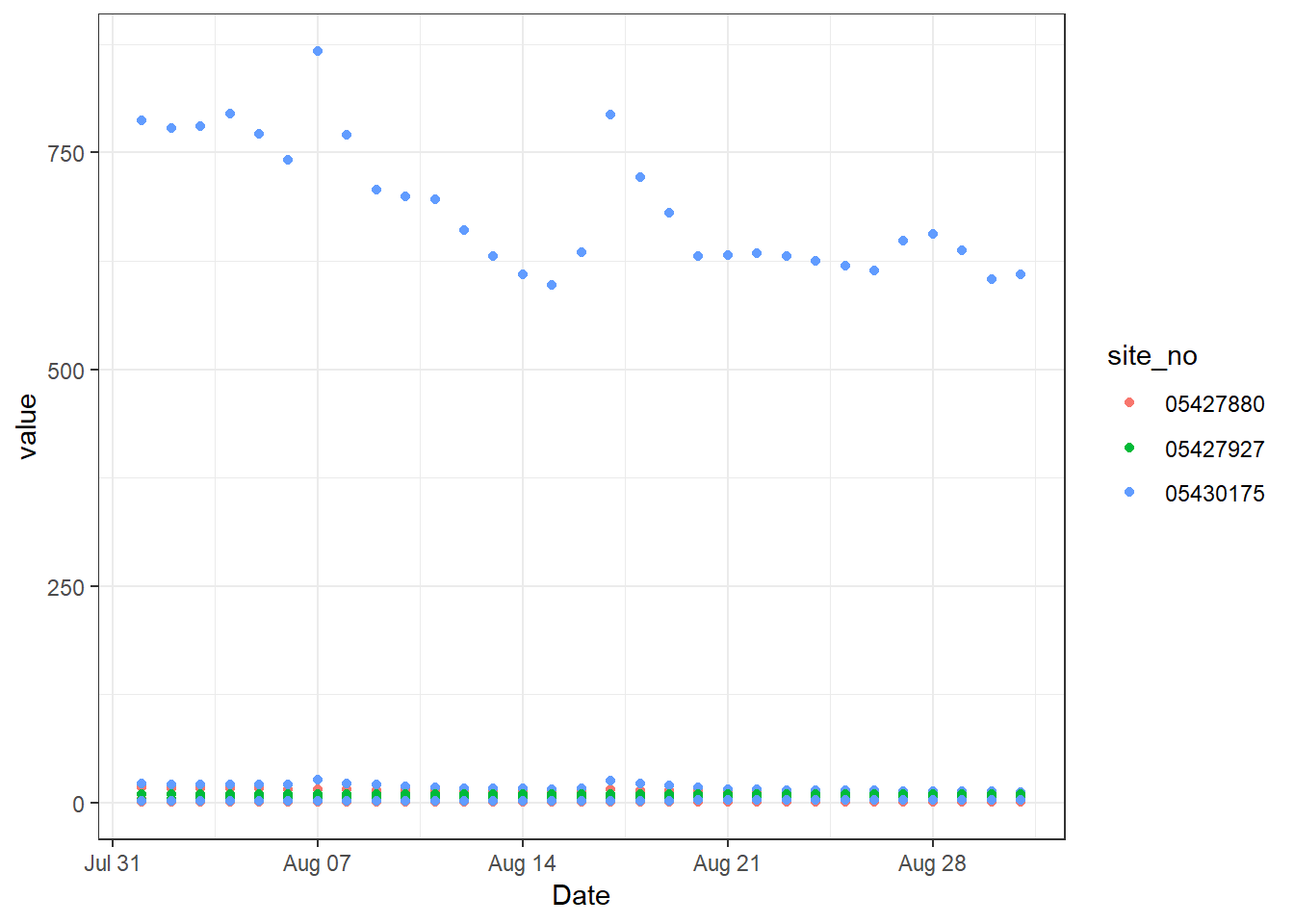
ggplot2 setup before faceting
Now, we know that we can’t keep these different parameters on the same plot. We could have written code to filter the data frame to the appropriate values and make a plot for each of them, but we can also take advantage of facet_grid. Since the resulting three plots that we want will all share an x axis (Date), we can imagine slicing up the figure in the vertical direction so that the x axis remains in-tact but we end up with three different y axes. We can do this using facet_grid and a formula syntax, y ~ x. So, if you want to divide the figure along the y axis, you put variable in the data that you want to use to decide which plot data goes into as the first entry in the formula. You can use a . if you do not want to divide the plot in the other direction.
# Add vertical facets, aka divide the plot up vertically since they share an x axis
p + facet_grid(parameter ~ .)
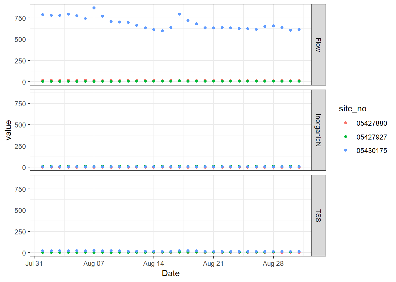
ggplot2 basic vertical facet
The result is a figure divided along the y axis based on the unique values of the parameter column in the data.frame. So, we have three plots in one figure. They still all share the same axes, which works for the x axis but not for the y axes. We can change that by letting the y axes scale freely to the data that appears just on that facet. Add the argument scales to facet_grid and specify that they should be “free” rather than the default “fixed”.
# Add vertical facets, but scale only the y axes freely
p + facet_grid(parameter ~ ., scales = "free_y")
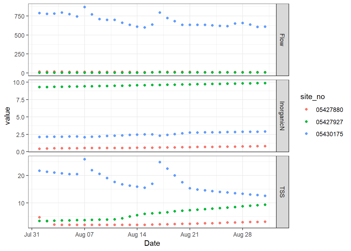
ggplot2 with freely scaled, vertical facets
From here, there might be a few things you want to change about how it’s labelling the facets. We would probably want the y axis labels to say the parameter and units on the left side. So, we can adjust how the facets are labeled and styled to become our y axis labels.
p + facet_grid(parameter ~ ., scales = "free_y",
               switch = "y", # flip the facet labels along the y axis from the right side to the left
               labeller = as_labeller( # redefine the text that shows up for the facets
                 c(Flow = "Flow, cfs", InorganicN = "Inorganic N, mg/L", TSS = "TSS, mg/L"))) +
  ylab(NULL) + # remove the word "values"
  theme(strip.background = element_blank(), # remove the background
        strip.placement = "outside") # put labels to the left of the axis text
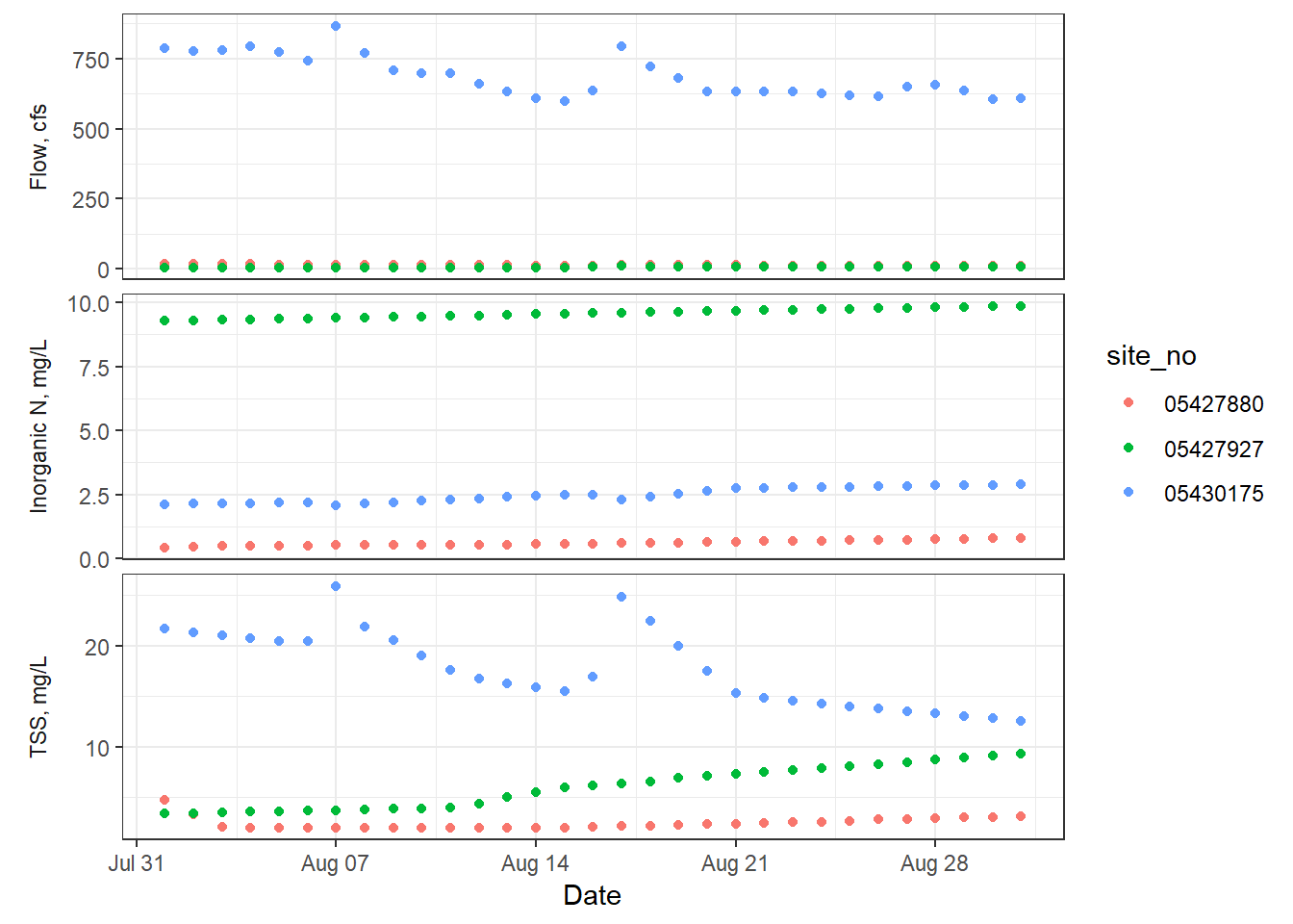
ggplot2 with facet labels as the y axis labels
There are still other things you can do with facets, such as using space = "free". The Cookbook for R facet examples
have even more to explore!
Using cowplot to create multiple plots in one figure
When you are creating multiple plots and they do not share axes or do not fit into the facet framework, you could use the packages cowplot or patchwork (very new!), or the grid.arrange function from gridExtra. In this post, we will show how to use cowplot, but you can explore the features of patchwork here
.
The package called cowplot has nice wrapper functions for ggplot2 plots to have shared legends, put plots into a grid, annotate plots, and more. Below is some code that shows how to use some of these helpful cowplot functions to create a figure that has three plots and a shared title.
Just as in the previous example, we will download USGS water data from the USGS NWIS using the dataRetrieval package (find out more about dataRetrieval in this curriculum
). This USGS gage site on the Yahara River in Wisconsin was chosen because it has data for all three water quality parameters (flow, total suspended solids, and inorganic nitrogen) we are using in this example.
library(dataRetrieval)
library(dplyr) # for `rename`
library(tidyr) # for `gather`
library(ggplot2)
library(cowplot)

# Get the data
yahara_daily_wq <- readNWISdv(siteNumbers = "05430175",
                          parameterCd = c("00060", "00530", "00631"),
                          startDate = "2017-08-01", endDate = "2017-08-31")

# Clean up data to have human-readable names
yahara_daily_wq <- renameNWISColumns(yahara_daily_wq,
                                     p00530 = "TSS",
                                     p00631 = "InorganicN")

# Create the three different plots
flow_timeseries <- ggplot(yahara_daily_wq, aes(x=Date, y=Flow)) +
  geom_point() + theme_bw()

yahara_daily_wq_long <- gather(yahara_daily_wq, Nutrient, Nutrient_va, TSS, InorganicN)
nutrient_boxplot <- ggplot(yahara_daily_wq_long, aes(x=Nutrient, y=Nutrient_va)) +
  geom_boxplot() + theme_bw()

tss_flow_plot <- ggplot(yahara_daily_wq, aes(x=Flow, y=TSS)) +
  geom_point() + theme_bw()

# Create Flow timeseries plot that spans the grid by making one plot_grid
#   and then nest it inside of a second. Also, include a title at the top
#   for the whole figure.
title <- ggdraw() + draw_label("Conditions for site 05430175", fontface='bold')
bottom_row <- plot_grid(nutrient_boxplot, tss_flow_plot, ncol = 2, labels = "AUTO")
plot_grid(title, bottom_row, flow_timeseries, nrow = 3, labels = c("", "", "C"),
          rel_heights = c(0.2, 1, 1))
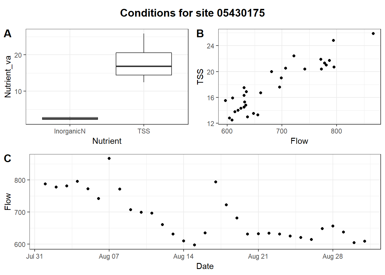
Multi-plot figure generated using cowplot
Categories:
Keywords:
Related Posts
Beyond Basic R - Version Control with Git
August 24, 2018
Depending on how new you are to software development and/or R programming, you may have heard people mention version control, Git, or GitHub. Version control refers to the idea of tracking changes to files through time and various contributors. Git is an example of a version control tool, and GitHub is a popular web interface for Git. That’s it. Easy!
Beyond Basic R - Mapping
August 16, 2018
Introduction
There are many different R packages for dealing with spatial data. The main distinctions between them involve the types of data they work with — raster or vector — and the sophistication of the analyses they can do. Raster data can be thought of as pixels, similar to an image, while vector data consists of points, lines, or polygons. Spatial data manipulation can be quite complex, but creating some basic plots can be done with just a few commands. In this post, we will show simple examples of raster and vector spatial data for plotting a watershed and gage locations, and link to some other more complex examples.
Beyond Basic R - Data Munging
August 1, 2018
What we couldn’t cover
In the data cleaning portion of our Intro to R class , we cover a variety of common data manipulation tasks. Most of these were achieved using the package
dplyr, including removing or retaining certain columns (select), filtering out rows by column condition (filter), creating new columns (mutate), renaming columns (rename), grouping data by categorical variables (group_by), and summarizing data (summarize).Beyond Basic R - Introduction and Best Practices
July 30, 2018
We queried more than 60 people who have taken the USGS Introduction to R class over the last two years to understand what other skills and techniques are desired, but not covered in the course. Though many people have asked for an intermediate level class, we believe that many of the skills could be best taught through existing online materials. Instead of creating a stand-alone course, we invested our time into compiling the results of the survey, creating short examples, and linking to the necessary resources within a series of posts. This is the first in a series of 5 posts called Beyond basic R.
The Hydro Network-Linked Data Index
November 2, 2020
Introduction
updated 11-2-2020 after updates described here .
updated 9-20-2024 when the NLDI moved from labs.waterdata.usgs.gov to api.water.usgs.gov/nldi/
The Hydro Network-Linked Data Index (NLDI) is a system that can index data to NHDPlus V2 catchments and offers a search service to discover indexed information. Data linked to the NLDI includes active NWIS stream gages , water quality portal sites , and outlets of HUC12 watersheds . The NLDI is a core product of the Internet of Water and is being developed as an open source project. .

